
---------
Travel Adventures in Denver
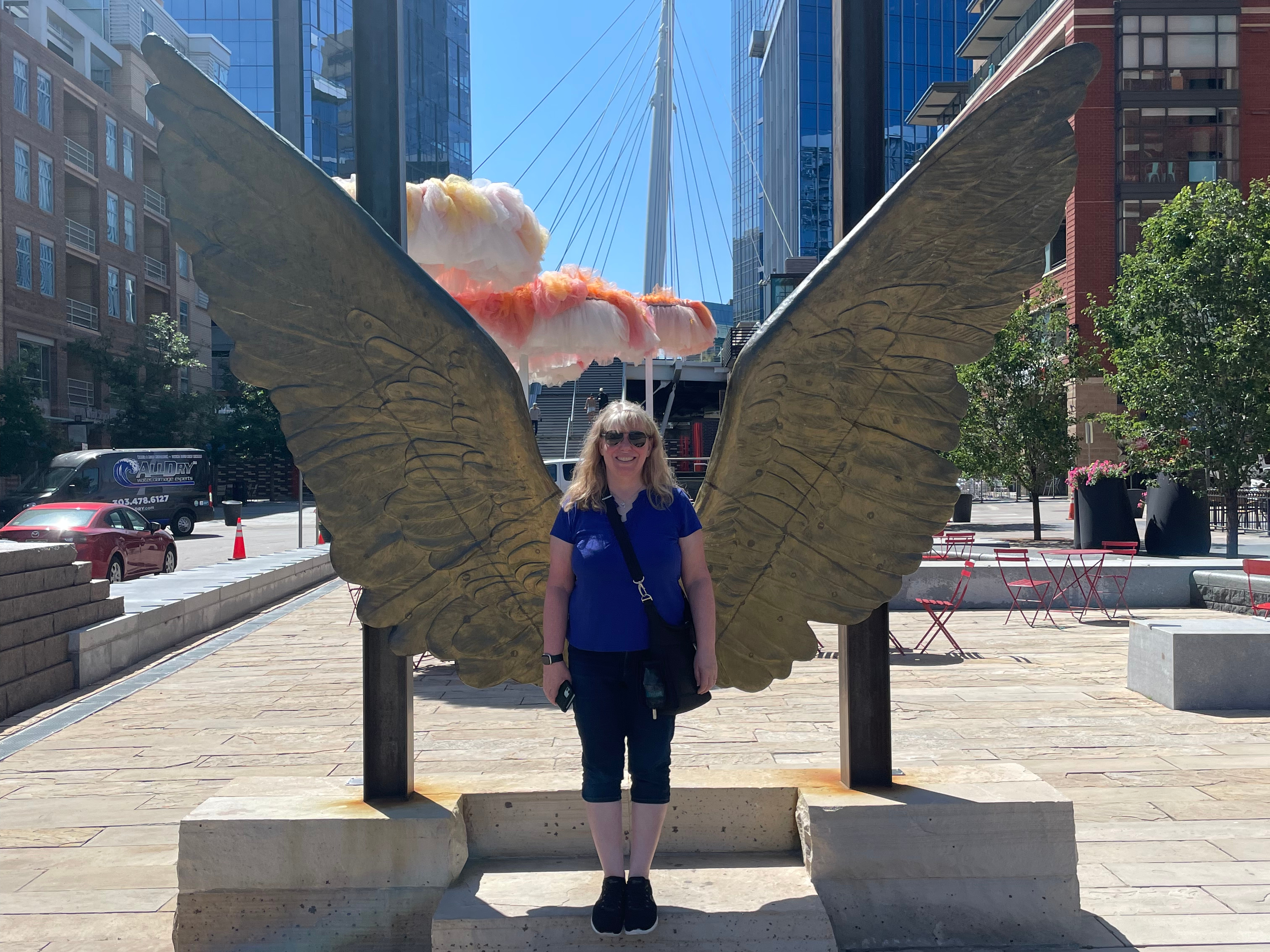
The Open Source Summit had ended the the previous evening, so Thursday, June 26 was a day of fun and team building for Steve, Kerry, Patrick, and Joseph, as well as any family members who came along (aka, me. I was the only one). The first item on the agenda was the second of two Urban Adventure Quests in Denver, this one in the LoDo neighborhood.
I had already spent a fair amount of time exploring LoDo, but the guys hadn't. It was fun watching them work through the Quest challenges and discover the neat features of the neighborhood.


As always, the Quest challenges were interesting and taught us a lot about the area. The second half of the Quest went beyond where I'd visited, so it was especially fun to see areas I hadn't already explored.


The Quest brought us to Confluence Park, where Cherry Creek and the South Platte River meet.


We were working on a Quest challenge when a train went by. No surprise there. The surprise was that it was carrying multiple airplane fuselages.


After the Quest, we said goodbye to Patrick, who was headed to the airport. The remaining four of us headed to lunch at an iconic location: Casa Bonita.


Casa Bonita is a Mexican restaurant, which opened in 1974 and closed in 2020 due to the pandemic. It reopened in 2023 with new (famous) owners after a major remodel. While it is a restaurant, it is so much more than that.
The Casa Bonita experience starts out like a typical restaurant. (Well, other than going through security first.) You check in, they take you to your table, you order, you eat. When you're done eating, you raise the flag on your table and they bring you sopaipillas. You pay your bill and then you leave the table.
.jpg)
But you don't leave the restaurant. Instead, you start exploring any of the 52,000 square feet that makes up Casa Bonita.


... explore Black Bart's cave...


... watch musicians, magicians, sorcerers, or a puppet show...


... watch a volcano erupt...

... and watch the famous cliff divers perform in front of a 30 foot waterfall. I saw the show three times from three different locations and it was a completely different performance each time, all equally impressive and entertaining.


You can walk behind the waterfall for a different perspective.


There's a museum at Casa Bonita, with artifacts from the original version of the restaurant. That was neat.


We went directly from Casa Bonita to Dinosaur Ridge.

Dinosaur Ridge is part of the Morrison-Golden Fossil Areas National Natural Landmark. It's considered the top dinosaur tracksite in North America, and one of the top such sites in the world.
You can explore Dinosaur Ridge on foot for free, but I highly recommend paying for a guided bus tour. Our guide was outstanding and I am certain that we learned and saw far more than we would have on our own. We were on the Apatobus.

We made three stops during our tour. Can you see the tracks, moving from the bottom right diagonally toward the left?


It was really interesting seeing how the different the tracks look in the various locations. Those rounded bulges that you see below are the tracks.


By the way, that's Red Rocks Amphitheatre off in the distance.

Our guide taught us how to spot rusty red dinosaur fossils in the rock.


After the tour, we went to the Exhibit Hall. It's included with the price of the bus tour. It's ok, but the real treasure at Dinosaur Ridge is the bus tour and the ridge itself.


The iguanodon's thumb spike was considerably larger than my non-spiky thumb.

There are several dinosaur models outside at Dinosaur Ridge, so we took a peek at those.


Bunny! We saw several rabbits and quite a few prairie dogs at Dinosaur Ridge as well. Kerry is a fellow house rabbit person, so the three of us pointed out every rabbit to each other.

We had a fantastic time at Dinosaur Ridge. We headed back to the hotel for our final Denver activity: dinner. We ate at the hotel restaurant, Former Saint. They have an open kitchen, which was fun for us foodies.

The food was outstanding. This was my tomato carpaccio (partially eaten before I remembered to take a photo.) It was so good.

And that was the final activity of a fantastic week in Denver. Steve and I headed to the airport early the next morning and had an uneventful (and non-turbulent) flight home. If you're looking for a vibrant city to visit, with tons of things to do, great food, and heavy emphasis on art, Denver should be at the top of your list.
---------
I will be taking the rest of this week and all of next week off from blogging while I travel for my dad's memorial service. I hope to be back to blogging on July 21.
