9/23/10

Using Your Handwriting

I wrote this post as a member of the Guest Design Team at Flamingo Scraps and wanted to share it here.

My grandmother was a scrapper (long before such a word existed!). She died in 2004, just six weeks before my wedding. I miss her very much and am sad that my son Trevor never got to know her. However, through her scrapbooks, Trevor can learn about the lives of his great-grandparents. Her scrapbooks are a true treasure- not only for the amazing pictures, but because she journaled in her own handwriting.

Your handwriting, love it or hate it, is unique to you. There is no better way to include yourself on your scrapbook page than using your own handwriting. I'd like to share a few tips to make it easier to include your own handwriting on your layouts.

Use a light box

If you have difficulty writing in a straight line, you could obviously draw or stamp lines directly onto your page and follow those. But there's another very easy way to get lines on the page that won't show and don't need to be erased. Simply put a lined index card (or any other lined paper) under your project, turn on the light box, and the lines will easily show through.

This picture shows how well the lines show through when the light box is turned on.


And here is the completed layout.


Journal on paper strips

I've heard a lot of people say they don't like journaling by hand because they're afraid of messing up their layout. The great things about using paper strips is that since you're not journaling directly on your layout, you can't mess it up. If you happen to make a mistake on a paper strip, you only have to rewrite that one strip.


By the way, this 2-pager has 33 pictures on it.  That's a new personal record!


Journal individual words

If you like the idea of paper strips, but want something even easier that you absolutely cannot mess up, try journaling individual words.


I hope you're inspired to try a few of these ideas.  Happy scrapping!

9/16/10

Stretching Supplies

TI wrote this post as a member of the Guest Design Team at Flamingo Scraps and wanted to share it here.

Like just about everyone else, I'm scrapping on a budget. One of my favorite ways to stretch my supplies is to use one piece of double-sided paper to accent a layout and then create a set of four coordinated cards.

Here is the layout I made for Flamingo Scraps' “Read Between the Lines” challenge.


As you can see, I only used ½ inch of the striped paper (Violette Wings from Webster's Pages) as an accent on this layout. I made four cards using the remaining 11½  x 12 paper. The first thing I did was carefully cut out the two butterflies that are on the reverse side of the paper. Next, I cut three rectangles, approximately 5¼ x 3¾,  to use as the bases for three of the cards. I cut the remaining large scraps into a variety of sizes of small rectangles to use as tags and other decorations. I kept all the tiny scraps set aside.

Next, I got out my ribbon tubs to dig around for a scrap of ribbon that would coordinate nicely with the paper. I keep long ribbon pieces rolled. The short pieces are just jammed loose into the tub. Perhaps not the best system, but it works well for me! I found a 6 inch piece of maroon ribbon that coordinated perfectly. I also pulled out a few scraps of embroidery floss.


Finally, I got out a few brads, my favorite ColorBox chestnut roan ink, pop dots, a paper piercer, a corner rounder, and some cute Fiskars stamps. I inked all the edges of every piece of paper. With all materials prepped, I was ready to begin.

For my first card, I used a solid lavender background, and layered a 1½ x 3¾ striped rectangle over it, adhering only the bottom portion to the background. I used two brads to secure the sides, thus creating a pocket to hold a tag. A quick stamp, piece of ribbon, and a popped up butterfly and the card was done.


The second card started with a solid lavender background, over which I layered a small striped strip. I popped up the butterfly, then used the paper piercer to punch holes showing the path of the butterfly. I finished the card with my message written on one of the tiny scraps I'd saved.


For my third card, I used a striped background, a small solid rectangle, and another tag. That was the end of the maroon ribbon and large rectangles.


With no more large background rectangles available, I adhered three different sized rectangles directly onto the card blank. I used the last lavender strip across the bottom and topped each rectangle with an embroidery floss bow.


 I definitely feel like I got my money's worth out of this single sheet of paper!

9/15/10

September Flamingo Five

As part of my month on the Guest Design Team for Flamingo Scraps, I participated in the Flamingo Five. I received the following five items:


Graphic 45 Hallowe'en in Wonderland,Wonderland Classifieds
 
Graphic 45 Hallowe'en in Wonderland, Through the Looking Glass

Craftables Flowers by Prima 

Pearls & Crystals Ice bling by Prima

Flamingo Scraps Vintage/Steampunk Embellishment Grab Bag

I have to admit... when I opened the package containing the Flamingo Five, I had a moment of panic. My style is simple, so it is unusual that I use five supplies on a single project, let alone five that someone else picked out!

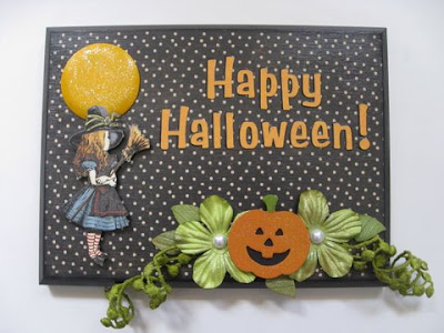
Fortunately, it didn't take long before I realized that these items would make a great Halloween wall hanging. I found an old wooden plaque, inked the edges with black Staz-On, and then used Mod Podge to adhere the dotted paper. I cut out Alice from the other sheet of paper and gave her a bunch of coats of Mod Podge too. With a coat of paint inside and out, and a smear of Stickles on top, the glass dome transformed into a full moon. The grungeboard pumpkin got a coat of paint and Stickles as well, and I backed it with a scrap of black paper. Then I punched out the negatives from the grungeboard butterfly and sprayed them and the Prima flowers with Glimmer Mist to make the pumpkin leaves.


To make the green vines, I sprayed the off-white trim with Glimmer Mist. When it was dry, I wound it around the handle of a foam brush and sprayed it with Krylon. Perfectly curled vines!


This project was a real stretch for me! What fun to work so far out of my comfort zone. I'm happy with the finished product, though I do wish I'd thought to ink the pearls green while I was coloring the vines and leaves. Oh well!

9/9/10

Mastering Multiple Photo Layouts

I wrote this post as a member of the Guest Design Team at Flamingo Scraps and wanted to share it here.

One of the most frequent questions I'm asked is how I manage to get so many photos on a page without it looking crowded. I'd like to share some of my tips as I walk you through my process.

Print 2x3 photos
    Obviously, the smaller your photos are, the easier it will be to fit lots of them on a page. I use Picasa's collage feature to put two photos together, then order that as a 4x6. The resulting 2x3 photos are small enough that many can fit on the page, but not so small that they're difficult to see and enjoy. As a bonus, it costs half as much to print photos this way than ordering them all as individual 4x6 prints.

    Here is a pile of photos from Trevor's summer swim lessons that I wanted to combine onto a single page. As you can see, I ordered five 4x6 prints. Once I cut them apart, I had ten 2x3's.


At this stage, I didn't know what my layout was going to look like, or how many of the ten photos I'd use. I shuffled the photos around on a piece of white cardstock until I was happy with the general arrangement.

Don't be afraid to crop
    Once I had a basic idea of which pictures I was going to use and approximately where they'd go, I started cropping. I knew what story I wanted to tell, so whenever possible I cropped the photos down to enhance that story. The other kids in Trevor's swim lessons weren't important to my story, so I cropped to allow Trevor and his teacher to be more prominent.

Include plenty of white space
    My next step was to cut my patterned paper down to allow at least an inch of white space on all four sides. This white space frames the layout and is critical to not having the layout look crowded. You'll notice that I added blocks for my title and journaling. By doing that, I ensured that I wouldn't be stealing white space later on to make my title or journaling fit.


Keep things linear
    By keeping my photos in rows, they don't appear crowded. It is possible to create gorgeous, non-linear layouts with 5 or more photos, but it is much more difficult! Once you approach 10 or more photos, it becomes even more challenging without using a linear approach.

Keep embellishments simple so as not to compete with the photos
    With this many photos on the page, I had to keep the embellishments simple so they wouldn't fight with the photos. When I saw Prima's Signs of Spring die cut paper, it immediately reminded me of waves. I cut off all four sides and then trimmed down one of them. I cut out a few orange fish from a vellum scrap, added some frosted lace Stickles around the edges, and added an orange photo turn to finish.


    Here's a peek at the back of the layout. I created a pocket directly on the back of the page to tuck away the progress reports and report cards Trevor's teacher gave him. This would also be a great place to tuck any photos that didn't make it onto the front of the page.