Pages

12/23/11

Christmas Cards

Christmas cards are a big deal to me.  I like sending them, I like getting them, I like saving them and looking back at them. 

I always send photo cards.  So Step 1 is taking the photo.  Because Steve has excellent equipment and skills, we take all our photos at home.  This works out very well- it's free and convenient.  However, with all three of us in the photo, there is no one left to help with composition, or to point out a stray hair or a twisted necklace.  I think we need a huge mirror set behind the camera!  So many good pictures are ruined because the composition is crazy or because someone's shirt is twisted in a really weird way*.  After looking through the pictures we took, we chose this one:

*Note the stripes on Trevor's shirt- if I hadn't been in the photo, I would have noticed that he needed to straighten his shirt.  It drives me crazy, but it's that way in all the pictures and I don't hate it enough to do a second photo shoot.

So that brings us to Step 2, the card.  I've toyed with the idea of making my own photo cards by hand before but came to my senses.  I would love making the first one or two, but I know that somewhere around card #16 I would go crazy.  With 30+ more to make.  So I find a cute photo template at my current developer of choice (in the past, I've used Shutterfly, Snapfish and most recently, Costco), upload the photo, and place the order.

I was all set to do the same thing this year.  I looked through the templates and couldn't find a single one that I liked.  Many of them clashed hideously with the green/blues of our clothes.  So I did something I've never done before- I made my own card digitally.  With no actual skills, knowledge or specialty software.  I used Picasa's collage feature to add a band of color to the top and bottom of my photo, added text, and then used the free version of Picnik to add a holly sticker.  I uploaded the completed design to Costco and ordered cards.  With only the free software, my mediocre skills, and a deadline, I was somewhat limited in what I could do.  In the end, I don't LOVE it, but it looks way better than any of the available templates did.  Here's our 2011 Christmas card:

I will be taking a short break from blogging while spending Christmas and New Year's with my family.  I'll be back on January 2.   Wishing you all Happy Holidays! 

12/22/11

Make it Work!

Back in January, I made a layout with pictures I took at 1:11:11 on 1-11-11.  Of course, I couldn't resist taking pictures at 11:11:11 on 11-11-11!  Because it was Veteran's Day, Trevor was home from school.  We were leaving for Disneyland the next morning, so I was busy packing while Trevor was getting started on the work from his Independent Study.  I made sure the camera was nearby and set a timer so that I wouldn't miss 11:11.  I love this quick little glance at our life when the date and time was nothing but ones.


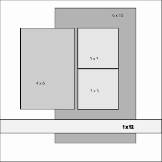
This layout is based on this sketch by Lead Fiskateer Rebecca.


The sketch was quite simple, which worked well because I wanted a casual, effortless look for this layout.  I decided to stamp the title, starting with a 1 and leaving spaces for the dashes and colons.  Only problem- I went through every single stamp I own and not a single dash or colon.  Definitely a 'make it work' moment.  The dash was easy- I found a smaller alphabet and turned an "i" on its side.  I didn't have a single stamp that would function as a colon.  I finally thought of something- I used my Crop-a-Dile to punch two tiny holes next to each other, then stenciled the colons. 


 I had another 'make it work' moment when it came to the banner.  Here's how it looked originally:

The "Old School Notebook" message seems really weird to me and not at all what I wanted on my page.  But there wasn't a good way to cut off just the alphabet that I wanted.  So I ended up using a pen to color the entire top brown, then laid a thin strip of the brown patterned paper over the center to cover the words.  The scan doesn't show it well, but I stamped some detail stitching on the brown. 

11:11:11 at 11-11-11 captured!

12/21/11

The Challenge of a Sketch

Working with sketches can be incredibly helpful.  They provide a great starting place, spark creativity and challenge me to go beyond my comfort zone.  Of course, working with a sketch can also be incredibly frustrating.  Sometimes it is really hard to design something that is 'me' when I'm working with someone else's sketch.

Such was the case with this sketch, designed by Heather Landry.

Heather challenged each of the Contributing Artists at Ideas for Scrapbookers to make a layout based on this sketch.  I accepted, as I really liked the sketch and love a challenge.  But there is so much going on in the sketch!  Banners AND flowers AND scallops AND triangles AND an oval AND an embellishment cluster.... awesome, but definitely not my style at all!  Heather's sample layout was super cute and totally inspirational, yet I really struggled to make a layout that was 'me'.

After some experimentation, I realized that the key to my success was going to be keeping all the various shapes and textures the same neutral color.  Here's what I made:

Overall, I like it.  It feels like something might be missing in the lower right corner (where the embellishment cluster was on the sketch), but nothing I tried worked.  So I'm calling it done!  The most important thing is that it tells the story and it is clearly based on the sketch, so in my book that is a success.

12/20/11

Color Challenge: Red, Pink and Lime

Whenever I can, I like to play along with the challenges at the Fiskateers site, especially Lead Fiskateer Tami's monthly color challenge.  December's was the "Mr. Grinch" challenge- use red, bright pink and lime green together.  Yikes- challenging, indeed!  To make it even more of a challenge, I decided to only use scraps- no cutting into a whole piece of paper to make a small card.

I envisioned a clean and modern Christmas card.  Here's what I made:  


I never thought I'd like red, hot pink and lime together, but I totally think it works.  Especially with the red rhinestones.  And that's why I love color challenges so much- I never would have tried this combination on my own!

12/19/11

December - Scrapping Stamper DT

This is one of my favorite layouts I've made in a long time.  And it took me far less time than usual.  I love that!

It is based on this sketch from The Scrapping Stamper

The whole layout started with the rosette from the girls paperie, which I got as a gift at a Fiskateers event from the amazingly generous LadyDoc.  From there I pulled the dotted and striped patterned papers (My Mind's Eye) and the background paper (Bella Blvd).  I put the pictures on cardstock (Bazzill) and used a Fiskars border punch on the edges.  Vellum, letter stickers (Making Memories), a tiny bit of journaling, and I was almost done.  I fussy cut the bats from another sheet of My Mind's Eye, then added Stickles to make them shine.

I love how it all turned out!

12/16/11

Decorating Gingerbread Men

I bake almost everything from scratch.... except gingerbread for decorating.  I can't bring myself to pass the delicious soft stage and bake it long enough to create the necessary solid structure.  I hate choosing between texture and stability.  So I buy a gingerbread kit each year for us to decorate.  Then if I want to actually eat delicious gingerbread (as opposed to so-so tasting rock-hard gingerbread), I make it with no plans to decorate it. 

Here is the layout from our gingerbread decorating in 2008 when Trevor was 2.  This is one of my all-time favorite layouts.  That's my mom in the pictures with Trevor.


Here is Gingerbread Decorating in 2009:


And here is 2010:


Here are the pictures from this year's decorating.  Check out Trevor's mad piping skills.  There aren't too many 5 year olds that know how to properly wield a pastry bag.  But in this house, you learn to work a pastry bag as a toddler.

 
Here's Trevor's finished cookie.

 
And here's Steve with his:

 
I was sitting across the table from Trevor and Steve as they were decorating.  As I saw their upside-down gingerbread men, I realized that the shape looked a bit familiar. 

 
It looks even better with some pink sugar on the ears and nose.

 
2011 has truly been The Year of the Rabbit around here!

12/15/11

One Little Word

It has been five years since Ali Edwards first introduced scrapbookers to "One Little Word."  The basic idea is that you select one word to focus on and strive toward during the coming year.  Ali says:
It can be something tangible or intangible. It could be a thought or a feeling or an emotion. It can be singular or plural. The key is to find something that has personal meaning for you. This is not your mother’s word or your spouse’s word or your child’s word – this is YOUR word.  One little word can have big meaning in your life if you allow yourself to be open to the possibilities...

I'd read about One Little Word for several years, but never felt moved to join in until last year.  As I read Ali's post at the beginning of January 2011, I felt a strong sense that my One Little Word was supposed to be "balance."

For years I've struggled with balance.  I am a mom, wife, daughter, sister, aunt, cousin, niece, godmother, goddaughter, daughter-in-law, sister-in-law, and friend.  I am a scrapbooker, card maker and crafter.  I am a Contributing Artist, Design Team member, and Fiskateer.  I am a classroom volunteer, a board member, a playgroup coordinator, church member, and a blogger.  A lot of different things fight for my attention and time.  Too often I give 100% to a few areas and don't spend enough time on others. 

As we come to the end of 2011, I've been reflecting on how balance has played a role in my life during the past year.  I've also been thinking about what I want my 2012 word to be.  While I have a concept in mind, I haven't chosen my One Little Word yet.  But I did realize that I am not done with my journey toward balance.  I'd like to continue to find a way to balance my various commitments and roles.

So I decided to make this:


It hangs on the wall of my scraproom.  Each year I will add the new One Little Word, but I will never remove an old one.  I'm hoping that displaying all my words will help keep them in mind.  I've added a blank tag, which will eventually display my One Little Word for 2012.


Did any of you choose One Little Word for 2011?  Have you chosen your word for 2012?  I'd love to hear!

12/14/11

'German Bells' Christmas Card Ornament

We're finally starting to receive 'real' Christmas cards in the mail. For a couple of weeks, all we've been receiving are the preprinted ones from the newspaper carrier, chiropractor, dentist, and insurance agent. I usually don't display these. Instead, I use the most beautiful ones to make ornaments.


---------

Origami Christmas Card Ornaments (German Bells)


Materials:


  • Christmas card 
  • scissors or paper trimmer
  • craft glue
  • rubber band
  • yarn or ribbon

Steps:


Cut the card into a square. It doesn't matter how large the square is, though the ornament is somewhat easier to make with a larger square. You can center the main image or not. I usually don't. 

Fold the card in half from top to bottom with the right side showing. Open it back up and fold it in half from left to right, again with the right side showing. Open the card fully and look at the back- the fold lines should make a plus sign.

Fold the card in half on one diagonal. Open and fold it along the other diagonal. These fold lines make an X.

Here is what the inside of your card should look like. I used a pencil to darken the lines for the purposes of the picture; yours won't have pencil lines.


Starting at one corner, make a 'paper airplane' fold. Unfold, then repeat for the three remaining corners.


Here's what your fold lines will look like when you are done with all the folds.

Hold the card in one hand and pinch the sides together as shown. Continue pinching until the points meet at the top.


Make a loop of ribbon to form a hanger. Slip the knot of the ribbon into one of the points of the ornament so that it gets trapped under the fold.

Add glue along the sides of the ornament and secure with a rubber band. Set aside until dry.


You can hang these ornaments from the tree, use them to decorate presents, or even place a small gift inside of one! 


Give it a try! 


12/13/11

Scraplifting a Scraplift

In 2009, I made this:
which was a scraplift of Kelly Noel's layout "Beat the Heat" from Creating Keepsakes, August 2008.


Notice the post-it flag?  I keep a file of all the layouts I've scraplifted, flagged with a post-it to say what layout it inspired. 

I was looking back through my albums while I was working on the layout about Trevor's first day of kindergarten.  I ended up scraplifting my "Trevor at 3" layout. 

I vaguely remembered that it was a scraplift, so I dug through the files to find the original.  I hadn't seen Kelly's "Beat the Heat" in 2+ years, yet the my scraplift of a scraplift is closer to the original than the first scraplift.  Funny!

12/12/11

My Stackable Snowman

About 15 years ago, I noticed nesting paper mache boxes showing up in craft stores.  I bought out all they had and made snowmen for practically everyone I knew.  I kept one for myself:


Even all these years later, it is still one of my all-time favorite Christmas decorations.  I smile every time I see it on our mantel.  And it is even more wonderful when I see them on display at the homes of my friends and family. 

I've made a few more over the years, for my inlaws and close friends I've met recently.  I can't tell you how many people have been shocked to learn my stacking snowmen are handmade.  They're really very easy to make.

You need: three round paper mache boxes with lids (different sizes so that they nest), black and white paint, orange Model Magic or Sculpey, ribbon, holly berries and leaves, buttons, and a q-tip.


Step 1: Form a nose from the Model Magic or Sculpey, following manufacturer's instructions about drying time.  Make sure the nose is small enough that when it is attached to the medium box, that box will still nest in the largest box.  

Step 2: Paint the largest box and its lid white.  Paint the medium sized box white.  Set aside to dry.  Paint the lid of the medium box black.  Paint the smallest box and its lid black.  Set aside to dry.

Step 3: Wrap a piece of ribbon around the base of the smallest box and secure.  Decorate with holly.  This completes the hat. 

Step 4: Dip the q-tip in black paint to make the eyes and smile of the snowman on the medium sized box.  Glue the nose in place.  This completes the face.

Step 5: Wrap a ribbon around the rim of the largest lid and secure.  Add a bow.  Glue buttons to the front of the largest box.  This completes the body.

Here is a view of how it looks for storage.  As you can see, there is a small amount of clearance between the holly and the nose and the next largest box.

To make this an even more special gift, consider adding a small gift inside the hat.  Your recipient will love it!

12/9/11

Cindy deRosier: Trendsetter

Pantone has released the Color Report for Spring 2012.


The Color of the Year for 2012 is Tangerine Tango, a gorgeous warm orange with a hint of red. Beautiful! I really like Cabaret too- a beautiful hot pink. As I was reading through the report, I came to this sentence: 

"For an ultra-bold vibrant look this spring, try mixing Bellflower with Tangerine Tango and Cabaret."

Now where have I seen that color combination before? Oh yeah... my wedding!


Steve and I got married in May 2004. Apparently I was eight years ahead of my time.  

Here's a close-up of my bouquet. I thought my wedding colors were tangerine, hot pink, and purple, but it turns out they were Tangerine Tango, Cabaret and Bellflower! If you look closely, you'll see tiny hints of Margarita in there too. 

I still love this color combination as much as the day I chose it. I feel vindicated, as I didn't get a lot of positive feedback about these colors as I was planning the wedding. I knew it would look spectacular (and my florist agreed), but others weren't so sure. Fortunately, I did end up with lots of compliments on the colors once everyone saw how they worked together.

Cindy deRosier: Trendsetter!

12/8/11

Lesson Learned

I am a big fan of Fun Family Crafts.  They have a wonderful collection of tutorials, suitable for kids of all ages.  I've been submitting some of my tutorials there; they've accepted my Ribbon Barrettes, Paper Plate Lion, Halloween Crayon Resist, Paper Plate Pumpkins, Pipe Cleaner Spiders, Costumes for Halloween Candy, Coffee Filter Turkeys, Edible Ornaments for Wildlife, and Snowman Gift Tags.  It's really awesome to see my work featured.

Each time one of my tutorials goes live, I make a point of checking what else they are featuring.  Recently, I found an adorable Melted Snowman Ornament.  Follow the link to see what it is *supposed* to look like- basically, you make a nice puddle of hot glue and add beads and some pipe cleaner to create an adorable melting snowman.  Ours did not turn out so nicely.

Sometimes, my crafts don't turn out like the picture because I am notorious for not following directions and doing things my own way.  But this time, it wasn't my fault!  First, take a look at how our snowman turned out:


He looks a little worse for wear, to say the least.  What the heck?  The glue gun was hot and I squeezed the trigger with no hesitation.  Why didn't my glue pool attractively?

I tried again.  This time, I squirted the glue in a circular motion rather than random globs.  Trevor was hovering over the snowman to put the facial features on the SECOND I stopped the glue.  A tiny bit better, but still not smooth and icy like the sample. 


And then it hit me- my glue gun is tiny.  It is smaller than my hand, with itty-bitty little glue sticks.  It squirts out in tiny amounts, not giant globs.  I love that my itty-bitty glue gun can get into tiny spaces and apply teensy bits of glue, but clearly this craft was meant to be done with a larger, standard-sized glue gun.  Which I don't own.

Final attempt.  I aggressively pushed the glue sticks in so that the glue would come out as rapidly and smoothly as possible, then jammed in the facial features immediately.  (Before starting, we'd decided to try paper features for variety.  We put a coat of Stickles on them ahead of time.)  This final one came out slightly better.


When I put them against a black surface, the flaws really show.  Drat.  I'd intended these as toppers on some gifts, but they are definitely not gift-worthy.  Lesson learned.

A little behind-the-scenes... while I was photographing our snowmen, Trevor asked to make friendship pins using the colorful beads we'd set aside when we carefully sorted out the black ones for our project. 

The snowmen weren't exactly a success, but the friendship pins are cute!