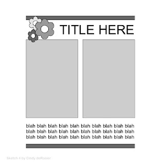
Remember the layout sketches I drew on vacation? It only took a few minutes each to convert those rough pencil sketches into clean digital versions, using Open Office Draw. Here's my Sketch #4:

I originally intended it for some more Young-Me-Now-Me layouts that I'm planning. But I had two random pictures of Trevor from Home Depot and Lowe's kids workshops that worked perfectly with this sketch. So that's what I did. This layout came together incredibly quickly.

A few fun facts about this page:
*I've had the hammer/lumber stickers for at least a decade. There's no date printed on the sticker back, which is a shame.
*In contrast to the ancient stickers, the patterned paper (from the Heidi Swapp 'No Limits' line) is the newest supply I own.
*The letters in the title started out turquoise (let's) and yellow (BUILD). I inked them to make them both look brown, but it's pretty clear that they started out as different colors. My eye goes right to that, but I decided that most people wouldn't notice. And even if they did, it looks fine.


Loveeeeeeeeeee this!! LOVING those photos, and that little saw sticker!! And loving how you used your sketch!!!
ReplyDeleteI seriously wouldn't have noticed the letters. I LOVE that you used older supplies.
ReplyDeleteThese photos are soooooo cute. Great page. I love how you turned your vacation sketch into a digital one and a scrapbook page. I like the different fonts for your title. I didn't notice the color difference until you pointed it out. You can also paint your alphas. That gives a more opaque coverage than inking.
ReplyDelete