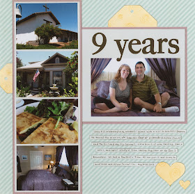
And here's what I made:

I kept most of the elements from the sketch, including the tags, hearts and journaling strips. I added two photos to the three in the sketch and did some flipping and rotating.
To see what the other designers made, head over to Ideas for Scrapbookers! Each layout is completely different!


Love this. The colors are perfect with the photos and a trend I'm seeing a lot of!
ReplyDeleteGreat take on the sketch! I didn't get a chance to do anything with it yet, but I did print it and have it next to my "layouts to do" pile! :)
ReplyDeleteLoveeeee this! LOVING the photos and the colors!!!!!
ReplyDeleteI love the simplicity of your page, Cindy. Your photos are amazing and they tell a wonderful story! I also like how you rotated the sketch, too. I love to do that! thanks for sharing this with all of us! It's fun to see everyone's different take on the same sketch!
ReplyDeleteLove how you've used the sketch to tell your story. :)
ReplyDeleteLove your take on the sketch and that patterned paper!!! Cute pic of you and Steve too :)
ReplyDelete