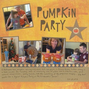
This layout, about my sister's family's annual Pumpkin Party in 2015, is probably the least 'me' layout I've made in awhile. Between the photos of different sizes, the tilt to the photos (and one photo not grounded at all), the very Bella Blvd. font with the filled-in letters that bug me, the lack of white/cream, the random yet prominent star, the use of both black and brown ... it just isn't a typical Cindy page.

But I like it. It was fun to push my style a little bit and play.

I think it's FABULOUS!!!!!!!!! It's fun to play out of our element!!!!!!
ReplyDeleteOMG the list of how it IS your style would have been shorter, bahahaha! I love your layout and good job trying something different ::claps::
ReplyDeleteI really like it! I will admit though, when I saw the preview picture in my reader, I did not immediately think it was one of your pages. It's not typical Cindy, but it's a great layout!
ReplyDelete