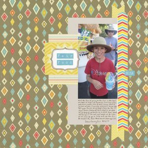
Fair Food (affiliate link)
This was a 3-hour challenge. Participants had to make a layout based on this sketch...
... BUT not as is. I flipped the sketch, used one photo instead of two, added a bunch of journaling in the lower photo position, removed some layers, and changed the shape of the text box. I thought the papers worked well with the rainbow of colors in our self-serve shaved ices. By the way, we're obsessed with those and a bunch of other fair foods. Everything in moderation, right? Right.


Hi Cindy! I love your take on this challenge! I love how you changed it up a bit and used one photo. And the journaling makes this page very special!!!
ReplyDeleteLove love love love this! Awesome colors!! Perfect with the photo!!!!
ReplyDeleteYou had me at fair food! My favorite are corn dogs, but... I have to ask if their non-pork corn dogs now...cuz Hamlet. If not, I don't eat them.
ReplyDelete...
Love the layered, yet still clean design and that you were able to include lots of journaling w/ out disturbing the overall balance of the layout!
I need to go to the fair with you. I prefer fair food at fairs. My family prefers to never touch fair food! So unfair! Pun intended.
ReplyDeleteI like your version of this sketch. I saw this sketch after the challenge close, and my design eye went straight to a plain background. I would not have thought to use a solid page of patterned paper, but it looks great!
Great mix of patterns and colours!
ReplyDelete