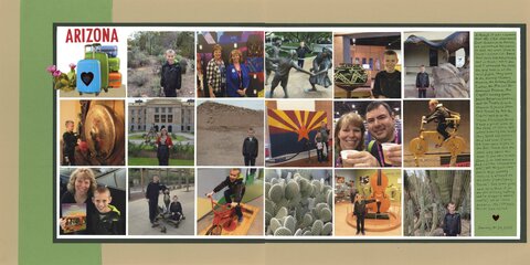
Arizona 2017 (affiliate link)
This layout was difficult for me, but I couldn't figure out why for the longest time. I think it's because some of the photos have an orange cast that looked really weird with the warm colors I was trying to use. When I switched to the cool green and neutrals, I was happier with the results. I think I'm going to do some color correction and reprint the worst of the photos. I think I'll like the layout more if I do.


Hey! I recognize some of those places! LOL!! I love this!! I think it looks great with the green!!!!!
ReplyDelete