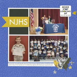
I made this layout about Trevor's induction into the National Junior Honor Society for a 3-hour timed challenge at Scrapbook.com. The challenge required us to use our favorite technique or product.

Using our favorite stuff? That's not exactly a challenge! My favorite layouts are clean and simple, with a patterned paper background and a grid of photos matted with cardstock. Handwritten journaling is a must.
I'm very happy with how this turned out, particularly the embellishments in the bottom left. The butterfly is hiding the giant head of the person who was sitting in front of me. There's still one more first-row head showing, but it doesn't bother me the way the other one did. Into the album!


Nicely done. You do grid layouts so well.
ReplyDeleteLove this! LOVING the grid!!!!
ReplyDeleteOkay, so I'm laughing at the reasoning behind your butterfly cluster placement (also, been there, done that)! I love how well balanced it is w/ the upper left corner square/flag title combo in the same colors!
ReplyDelete