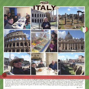
I hadn't planned to scrap our European adventure from April so soon, as I still have trips from 4+ years ago waiting to go in the albums. But when Paper House Productions sent me a box of goodies that included their Italy-themed stickers (affiliate link), I couldn't wait to dig in and play.

As you can see, I kept the layout very clean and simple. I chose 9 photos (four of scenery and five with people, making sure everyone from our family of nine appeared in at least one photo), mounted them on white, then put that on a green paper with a subtle diagonal stripe. I added the red as a border, wrote my journaling, then added stickers. I combined two to make the title, then two more to draw the eye where I wanted it. It's not a masterpiece, but I'm happy with how it turned out.


Looks like we are both working on documenting our trips! Beautiful lay-out!
ReplyDeleteNicely done!
ReplyDeleteLooks great!
ReplyDeleteThis is beautiful! LOVING the little heart and the photos!!!!!
ReplyDelete