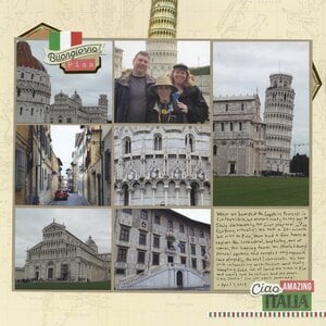
I've completed another page about our April adventures in Europe. This layout is all about our day in Pisa.

I chose seven photos to use, only one of which included people. That's unusual for me - normally, I like to have more people pictures than scenery photos on a layout. But I had to work with what I had and we'd taken tons of photos of the architecture and almost no pictures of each other.
I received two sets of Italy-themed stickers from Paper House Productions, which I combined with stickers from Reminisce and Simple Stories to embellish the page. But I didn't use them as is. Take this sheet of dimensional stickers, for example:
If you look carefully at my page, you'll see that I took apart the "Discover Rome" sticker and cut the background diamond to use in two different places. I layered "Buongiorno" to cover "la dolce" and tore "Ciao" off of "Bella" to use at the bottom of the page. As another example, I'm sure you noticed the Leaning Tower sticker. I couldn't make the sticker fit anywhere without covering things I didn't want covered... until I stuck behind the photo of our family. I had to chop off the top, but I like the way it draws the eye to the one and only people photo. I love the challenge of seeing how I can make embellishments work for me.


This is fabulous! LOVING how you dissected the Rome sticker!
ReplyDeleteLove this!We visited there 3 years ago!
ReplyDeleteI love your travel pages... they really seem to tell the story of your day/the event! I wish I had the knack for that instead of being overwhelmed!
ReplyDelete