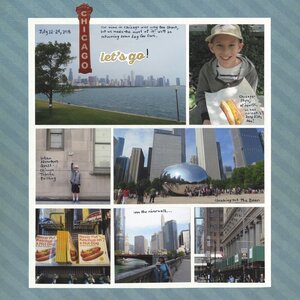
I tried something completely different with this layout - I did my journaling directly on the photos. And rather than keep it all in one place like usual, it's spread out in multiple locations. I'd already cut out a bunch of photos I'd liked to have included and I didn't want to axe one more just to make a journaling block.

There's something else unusual about this page and that's the subtle title. I'd intended to use the skyline photo for a large title, but after I cut out the CHICAGO marquee it seemed repetitive to write CHICAGO under that. Instead, I went looking for a sticker. I liked the way "CHICAGO, let's go!" sounded, so that's the title.
We had such a fun time in Chicago. If you'd like, you can read all about our time in the Windy City and see the pictures that didn't make the cut for the layout.


Love this! LOVING how you journaled on the photo and the title!!!
ReplyDeleteThis is wonderful! Love the idea of journaling on photos!
ReplyDeleteLooks fab! I love journaling on photos!
ReplyDelete