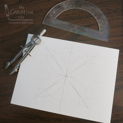
Kids LOVE compasses. I'm talking about the circle-drawing compass, not the direction-finding compass (although kids love those too). It was always a very exciting day in 5th grade math when I passed out compasses for the first time. We always started with art so my students could become familiar with their compasses and play with them before jumping into geometry lessons. I made this compass art yesterday, but it's typical of what my students would have made back in the day. Affiliate links below.
---------
Compass Art
Materials:
- drawing paper
- compass
- protractor
- something for coloring (I used Prismacolor art markers)
Steps:
Make a point in the center of the paper, then use the straight edge of the protractor to draw a horizontal line that passes through this point. Use the protractor to make a vertical line (90° from the horizontal line) and two vertical lines (45° and 135° from the horizontal line) that pass through the center point. This is shown in black below.
Open the compass wide to make a circle that will nearly fill the paper. Place the point of the compass on the center point and draw the circle. Add a second circle that is slightly smaller than the first by slightly reducing the distance between the points of the compass and keeping the point of the compass on the same center point. This is shown in blue below.
With this basic framework, I would set my students free to create. I encouraged them to play with different sizes of circles. Most kids chose to make symmetrical designs, while others went for asymmetry. Some filled their designs with dozens more circles of all different sizes, while others made a more minimalist piece. My goal was for them to practice compass skills and whatever artwork they created was the means to that end.
For this sample, I've added 12 more circles (shown in green, orange, and pink).
The next step is coloring.

Once it is completely colored, use a black Sharpie to outline the design.

Finally, add dots and curls in a few strategic places. (Strategic because the pencil lines show through and this hides them nicely.)


OOh this is fancy! Looks so pretty!
ReplyDeleteLooks amazing! I know I have a compass somewhere...I want to try this!
ReplyDelete