This project is completely different than anything I've ever made. Nothing about this abstract painting is my style, and that's intentional.
One of my creative goals for 2022 is to choose three artists with radically different styles than my own and make artwork inspired by them. My first artist is Julie Fei-Fan Balzer. She is a contemporary mixed-media artist and printmaker. I first became aware of her about 15 years ago when she did a lot of scrapbooking and I have continued to follow her ever since. She's transitioned completely away from scrapbooking (at least publicly), but I find her work to be very interesting, even if it's not my style. Maybe it's so interesting to me BECAUSE it's not my style.
Julie does a lot of work with quilting, gelli printing, and collage, but I chose to focus on her painting. Specifically, her abstract painting. As my first step, I went through Julie's blog and videos to find some examples to analyze.
Julie does a lot of work with quilting, gelli printing, and collage, but I chose to focus on her painting. Specifically, her abstract painting. As my first step, I went through Julie's blog and videos to find some examples to analyze.
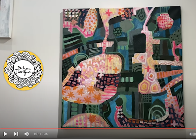
Here's a screenshot from Abstract Painting Re-Do - Updating a painting 6 years later.
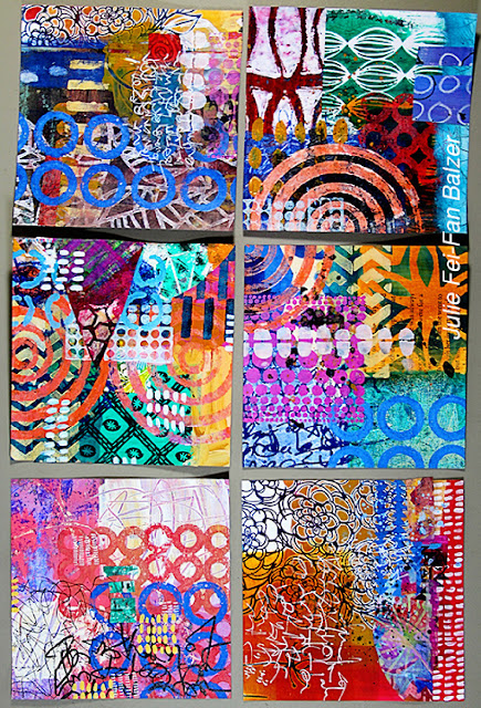
And here are six projects from a workshop Julie led.
I made a list of the qualities that, to me, define her style.
- messy but intentional
- layers, with occasional transparency
- swaths of paint in bold colors
- patterns - hash marks, circles, plus signs, dots, stripes
- high contrast
- repetition
- use of many stencils
- crayon and colored pencil patterns or scribbles
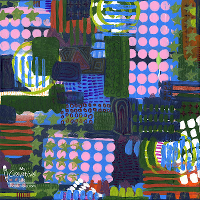
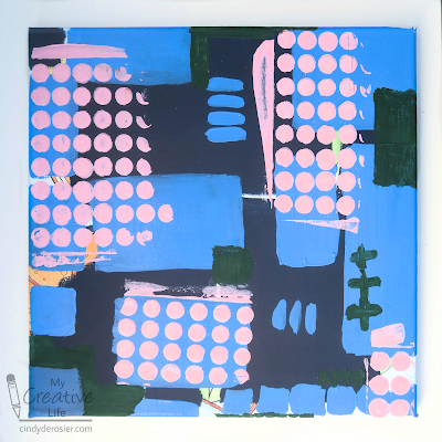
In the video above, Julie takes an existing painting and reworks it with an abstract design. She ends up covering 90% or more of the original work. I've never done that. I always start with a plain white surface. But in an effort to mimic Julie's style, I started with this painting and covered it up with blocks of color in two shades of blue.
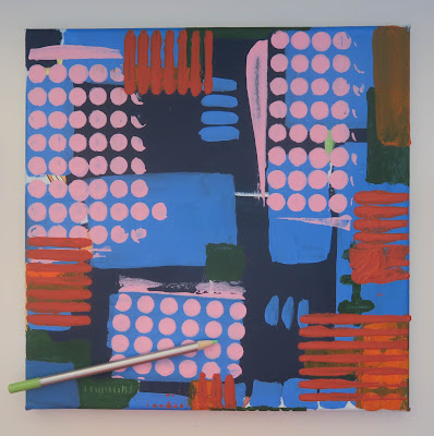
When that dried, I used a stencil to make the pink circles. In the past, I've always been very careful when using stencils to make sure everything is completely covered and nothing slops over the side to ensure a perfect design. I completely threw that aside for this project. I added some forest green. At this point, I'd covered 98% of the original painting.
But it was a little too Cindy and not enough Julie. I used another stencil with a burnt orange paint and that helped. Then I went in with a lime green colored pencil and added some pattern.
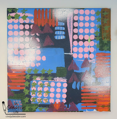
I stamped some green stars and purple triangles, then tried to add some details with a white paint pen. That didn't work, so I grabbed white spray mist. I hated the results.
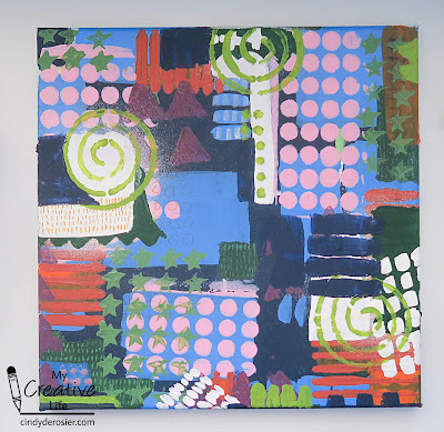
But the best thing about this style of painting is that you cover anything you don't like. I painted over the white mist with white blocks, then stenciled the lime green swirls. I used a Q-tip for the lime green dots and splotches, always focusing on repetition, contrast, and pattern. Then I painted more areas with dark blue and forest green.
Along the way, I kept asking myself how I'd know when it was done. I'm happy to report that (a few more layers of stencils and a whole lot of details later) I felt confident that I'd finished.
As I said, there is nothing about this painting that is remotely my style, but I actually like it. It's interesting to me and the process of creating it was a lot of fun. I learned a lot along the way and am definitely opening to trying another abstract painting in Julie's style someday.
One final note: I really enjoy Julie's blog and wanted to recommend one specific post that stuck with me. It is called What is Helpful Feedback. After sharing her thoughts, she offers up a piece of her work and requests feedback in the comments. It's very interesting to read all the feedback she received and to see how people see things so differently.



I think you did an awesome job. Glad you tried something radically different. :)
ReplyDelete