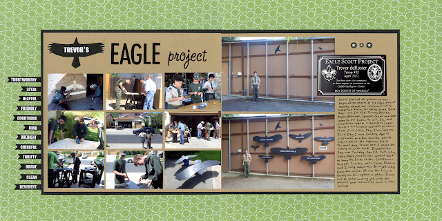
I blogged about Trevor's Eagle project right away, but now it's finally in the album 13 months later.
Trevor's Eagle Project (affiliate link)
I really struggled with this page. I wanted to show a lot of pictures of Trevor's two workdays, but I also wanted to include the before and after photos from the installation. That meant a double-pager. Once I finally got the photos the way I liked them, I went back and forth with the colors. I switched out the papers countless times before settling on the khaki with a small black border for the photos and the green patterned paper as a background. It took awhile to figure out how to do the title. I added the journaling and thought I was done.
At the last minute, I decided there was too much empty green space. I added the 12 flags along the left that list the points of the Scout law. I liked the way it looked and decided the layout was definitely done. I scanned the page and put it in the album.
I liked it in the album, but when I saw it on my monitor, it looked really unbalanced. I added the 7 Scout ranks on the right and I'm much happier with the page.

.png)

I think it would look more visually balanced if the two larger photos had a black border. You could do it with a marker. Maybe see how it looks digitally first.
ReplyDelete