Pages

4/16/25

Hello Kitty Easter Egg

Any Hello Kitty fans? Hello Kitty (real name: Kitty White) is a British cat, created by a Japanese designer in 1974 for the Japanese company Sanrio. She lives her parents and twin sister, Mimmy. Oddly, this family of cats has a pet cat. Hello Kitty first appeared in the United States in March 1975. I was three at the time, which explains why I don't remember a world without Hello Kitty. 

All this to say, I made a Hello Kitty Easter egg and I'm really happy with how it turned out. Affiliate links below. 


Hello Kitty Easter Egg


Materials:


Steps: 

Cut a ring off the cardboard tube that is approximately 1.5" high. Then cut out the felt. You will need a pink rectangle that is the same height as the ring and the same length as the circumference. Cut three small scallops from that piece for the neck and sleeves. Use the pink scraps to cut two triangles and a square for the hair bow. Then cut a length of lavender felt for the shirt and two white ears. 


Glue the lavender rectangle behind the pink rectangle. Then glue the pink rectangle around the cardboard tube ring. Place the egg, rounded side up, into the ring. Use a black paint pen to draw Hello Kitty's eyes, nose, and buttons. Glue the ears and bow in place. 

Snip six short pieces of black wire for Hello Kitty's whiskers. I experimented with a lot of ways to attach them and finally found that the best way is to make a tiny bend at the end of each wire, apply glue, then hold it in place until the glue dries. This is tedious, but effective. Hot glue would be faster, but it would be visible when it dries. Superglue might be better. Faster, anyway. 

4/15/25

Oscar the Grouch Easter Egg

When I was making my panda Easter egg, I set it on top of a cardboard tube so it wouldn’t roll off the table. The shape reminded me of Oscar the Grouch in his garbage can. I’m a big fan of Sesame Street, so this was a really fun egg to decorate. Affiliate links below. 


Oscar the Grouch Easter Egg


Materials:


Steps: 


Draw Oscar's eyes on the egg. Paint the egg green, leaving the eyes white. (I didn't do this and had to put multiple coats of white paint over the green. Avoid that problem.) 

Cut a circle out of chipboard to make Oscar's trash can lid. Paint the lid and the cardboard tube grey. 

Use a black paint pen to draw Oscar's mouth and pupils. Use a brown paint pen to make his eyebrows. Use acrylic paint to add a tongue on the mouth. 

With a pencil, draw vertical lines on the trash can. Draw lines on the lid so that it looks like a cut pizza. Add a line down the center of Oscar's tongue. 

Rub a little bit of black ink onto a tissue or cotton ball. Rub it randomly on the trash can and lid so that it looks scuffed up. 

Place Oscar in his garbage can, then glue the lid to the back of his head. 

4/14/25

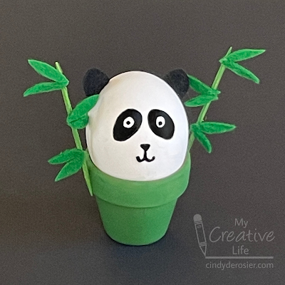
Panda Easter Egg

Dyeing Easter eggs is so much fun, but there are a lot of other ways to decorate eggs that are just as fun. I used a black paint pen to turn an egg into an adorable panda. Affiliate links below. 


Panda Easter Egg


Materials:


Steps: 


Paint the clay pot and the toothpicks green. Set them aside to dry. 

Put the egg onto something to stabilize it. (I used a ring cut from a cardboard tube.) Use the paint pen to draw the panda's eyes, nose, and mouth. 


Cut a pair of ears from black felt and set them aside. Cut 12 skinny leaves from green felt. 

When the paint is dry, glue the ears to the egg and the leaves to the toothpicks. Then glue the toothpicks to the clay pot. Rest the panda inside the pot. 

4/11/25

Religious Easter Crafts for Kids

For the past few days, I've been sharing ideas for Easter crafts that relate to the religious aspect of the holiday: Jesus' death and resurrection. Crafts like these are a lot less common than secular Easter crafts featuring jelly beans, bunnies, and chicks, so I put together a roundup to help parents and Sunday School teachers find project ideas for Lent and Easter. 


You can find all of these crafts (and more) on my Easter Crafts page. Scroll down to the bottom and you'll see all of the religious crafts grouped together. 

4/10/25

Tape-Resist Cross Easter Eggs

This fun Easter craft combines a more secular symbol of Easter (dyed eggs) with a religious symbol (a cross). They're really fun to make and something crafters of all ages will enjoy. Affiliate links below. 


Tape-Resist Cross Easter Eggs


Materials:


Steps: 


Cut egg shapes out of cardstock. I made a pattern with scratch paper and then used that to cut out multiple eggs at once. 

Cut a strip of painter's tape about half the height of the egg and place it vertically on the egg. Cut a slightly shorter piece of tape to make the cross piece. Press firmly on both to make sure they are flush with the paper. 


Use blending brushes to add ink to the eggs, directly over the tops of the crosses. You can do a single color or blend lots of colors together. Don't leave white spaces or the tape-resist effect won't work as well. 


Peel up the tape and you should have perfectly white crosses on your colorful eggs. Enjoy!

4/9/25

Crown of Thorns Craft

I wish I could remember all the clever crafts I did in Sunday School during the 70's and early 80's. I had some really creative teachers. I vaguely remember a Play-Doh crown of thorns. My version is made with Model Magic. Affiliate links below. 


Crown of Thorns Craft


Materials: 


Steps: 


Begin by making a 'stain' for the toothpicks. Place a small amount of brown paint into an empty container. Add a few drops of water and stir until it is well-mixed. It should be thin, but heavily pigmented. Cut the toothpicks in half with the wire cutters and drop them into the stain. Swish them around so they're all covered. Set them aside. 

Knead the Model Magic. When it is soft, use about 1/8 to make a thin rope. Lay it in a circle on your work surface. Make another similarly-sized rope and wrap it around the first one. Continue to make ropes and add them to the previous ones. You're not going for a neat braid - you're aiming for a messy crown of thorns. 

When you are happy with the crown, remove the toothpicks from the paint and dry them with a paper towel. Insert them into the crown at different angles. 

I chose to display my finished crown with a Bible verse that references it: 

Matthew 27:29 ... and after twisting some thorns into a crown, they put it on his head. They put a reed in his right hand and knelt before him and mocked him, saying, “Hail, King of the Jews!”

4/8/25

Palm Sunday Craft for Kids

Palm Sunday has special meaning for me as a mom. When Trevor was little, Palm Sunday was his absolute favorite church service of the year. He loved proceeding into the sanctuary waving palm fronds, then spending the rest of the service weaving palms together. He would ask for months when "Pom" Sunday was coming. It was so cute. When it came time to choose a date for Trevor's confirmation, we chose Palm Sunday.    

I wish I had thought of today's craft 15 years ago or so. Trevor would have loved it. But hopefully there's another young child who loves Palm Sunday that will enjoy this craft. Affiliate links below. 


Palm Sunday Craft for Kids


Materials: 


Steps: 


While the glue gun is heating, arrange the small craft sticks on one of the large craft sticks to look like a palm frond. Leave enough space at the bottom so there is a "handle" to hold onto the palm. Glue each stick in place. 


Paint the palm frond green. While it is drying, learn about the word 'Hosanna.' 


Write 'Hosanna' on white cardstock and glue it to the second large craft stick. Now put your sign in one hand and your palm frond in the other and practice for Palm Sunday!

4/7/25

Fairfield in Full Bloom

I am a huge fan of public art. I love cities like Davis that have enough public art that you can make a day of seeing it all. The city we live in doesn’t have a lot of public art, but there is some. And now, we have a beautiful new mural highlighting everything that makes Fairfield special. 


The mural was a joint effort between Sustainable Solano, artist Sheree Rayford, and members of the community. Several months ago, a survey went out, asking residents to describe our town and the flowers that best represent it. Rayford used the results to design and paint the main portion of the mural. On March 22, there was a community event where we could add our handprints to the mural. 


I can’t believe I used my right hand. It’s like I don’t even know my own brand. Sigh. 

The community event was so much more than just handprints. There were stations to plant flowers to take home, to paint kindness rocks, and to learn about sustainability, just to name a few. Lunch was provided and it was a really festive and inclusive event. 

After all the handprints were in place, Rayford added the descriptive words. I love how the mural turned out. I’m so glad I was able to be a part of Fairfield becoming more beautiful. 

4/4/25

Brayden and Tulip Update

It has been a long, challenging process, but I'm happy to report that Brayden and Tulip have finally bonded! 


Things looked promising back in November when we brought Tulip home. Little did we know that it would take five months and an insane amount of work to bond these two. After a month of fights and little progress, we hired a professional bunny bonder. The rabbits made a small amount of progress, but not nearly as much as we'd hoped. Brayden was acting territorial and was clearly nervous around Tulip, frequently snapping at her; Tulip was acting bossy and would not respect Brayden's clues that he was upset. 

In February, we completely rearranged our furniture in hopes that changing the environment would eliminate Brayden's territorial behaviors and give us a fresh start. Each rabbit had their own large x-pen (16 square feet), which opened into a common play space. 


For two hours each morning and two hours each evening, I let them into the play space to interact. I followed them closely, petting them and soothing them as they approached each other, either cautiously (Brayden) or boisterously (Tulip). My attention was on them every second, because that's all it took for a scuffle to break out. Scuffles were fairly frequent at first, but true fights with fur flying were rare. Over the course of the bonding process, I broke up a total of four fights. (And I was bitten three times.) 

I really wanted this bond to work, so I kept at it. Each day, there was a little bit of progress, which is the only thing that kept me going. We expanded the play space and introduced new toys one at a time. Soon, I could trust both buns not to lunge at each other if I wasn't right there. That was a huge relief. 


As I continued to work with them, Brayden and Tulip were showing more and more signs that bonding was near. They wanted to be together and were approaching each other frequently. 

Up until this point, I had closed their individual cages when they came into the common play area, so that each had a "safe zone" that the other had never been in. Then one day, Tulip zipped into Brayden's cage before I could close it. She explored every inch as Brayden watched. He didn't seem to mind, so I let him into her cage. Same thing. He explored every inch and it didn't bother Tulip. From then on, I kept both cages open during playtime and continued to supervise closely. 


In mid-March, it clicked. The scuffles ended. Brayden started grooming Tulip, having accepted her as the dominant bun. And once he did that, she returned the grooming. I still supervised all their joint playtime just in case, but I could actually relax on the floor with a magazine instead of following them around constantly. Of course, if you put a magazine on the floor, you're going to have a bunny helper. Brayden was highly interested in this article about green foods - some of his favorites!


Another thing that happens when you're on the floor with rabbits - you become a jungle gym. 


As the weeks have passed, the buns are spending more time together and we're supervising less frequently. There have been no issues. They choose to spend most of their time near each other. We separate them when we leave the house and when we're sleeping, just in case. Eventually, that will change. Our plan is to increase their play area to include the entire living room and dining room and make sure that's ok. If it is, we'll put our dining room back together and they'll be together 24/7 as the true house rabbits they deserve to be. 

4/3/25

Highest Honors Ceremony

Our school district holds a special Highest Honors Ceremony before graduation to celebrate all of the seniors completing high school with a grade point average above 4.0. It's a big deal. The superintendent, school board, and principals of all five high schools conduct the ceremony. Each graduate is introduced with where they will be going to college, what their major will be, and what career they hope to have. They receive the honor cords they'll wear at their graduations. It's really inspiring and a great way to acknowledge the hard work that goes into earning four years of perfect grades in advanced classes. 

Highest Honors Ceremony (affiliate link)

There were 190 students at the Highest Honors Ceremony for the Class of 2024. By now, they are 2/3 of the way through their freshman year of college. I sincerely hope they are all thriving and continuing to be as successful as they were in high school.  

4/2/25

50 State Quarters Program - Fun Facts

Between finishing a coloring page for each of the 50 state quarters and then grading the design of each quarter, I learned a lot about the 50 State Quarters Program. I found out about inspiration, innovations, and clever design decisions, as well as errors, omissions, and seriously disgruntled artists. Read on for the most interesting of the fun facts I discovered. 


Fun Facts About the 50 State Quarters Program


  • Each of the 50 state quarters was minted for only 10 weeks.

  • More than 34 billion coins were minted during the 50 State Quarters Program, but the amount produced for each state varied greatly. Virginia had the greatest number of quarters produced (1.59 billion) and Oklahoma had the fewest (416.6 million). 

  • The inspiration for the 50 State Quarters Program came from Canada. Canada issued commemorative quarters featuring each of the 12 provinces and territories in 1992 to honor their 125th anniversary.


  • The Alabama state quarter is the first US coin featuring Braille writing.

  • The Hawaii state quarter honors King Kamehameha, making it the first circulating US coin to feature royalty. 

  • New Jersey's quarter was the first coin in history to show George Washington on both the front and the back.

  • Kermit the Frog was named the Spokesfrog for the 50 State Quarters Program. He appeared in commercials and print ads.  


  • The most significant minting errors in the state quarter series include the Wisconsin "Extra Leaf" quarters. There are two versions of the mistake: one with a "low leaf" and one with a "high leaf" next to the cornstalk.   

  • The state outline on the Georgia quarter leaves out Dade County, in the northwestern part of the state. It wasn't a minting error, but rather a design problem. While that was presumably an accident, in 1860 the county seceded from both the US and the state of Georgia. That was never legally recognized and the county "rejoined" the state and the nation in 1945. Indiana's outline is also missing part of its northwestern corner. 

  • On Tennessee's state quarter, there are only five strings on the 6-string guitar (which shows 6 tuning pegs). 


  • The 50 State Quarters Program was hugely successful. Roughly half the population collected state quarters, making it the most successful numismatic program in US history. The government has made approximately $3 billion from collectors taking coins out of circulation. 

The 50 State Quarters Program ended in 2008, but that was not the end to commemorative quarters. Three additional programs have led to quarters honoring US territories, national parks and forests, and American women. These programs include: 

There are some gorgeous designs. I have no plans to color them all, but I may end up coloring a few of my favorite quarters in the future, after I've forgotten how much work it was coloring the 50 I did!

4/1/25

Spuddy Buddy Idaho Potato Craft

The mascot of the Idaho Potato Commission is a potato named Spuddy Buddy. He was born in 1983 as Potato Buddy, dressed in a bandana and cowboy hat, and appeared in ads to promote Idaho potatoes. Ten years later, he got a big makeover, giving him his current look. Spuddy Buddy became known nationally after a 1996 appearance at the Today Show window and can now be seen in ads and in person at football games, with the Big Idaho Potato Truck, and many other places. He’s such an icon that I thought it would be fun to turn him into a craft. Affilliate links below. 


Spuddy Buddy Idaho Potato Craft


Materials: 


Steps: 


Begin by cutting out all the pieces you will need: 
  • one tan rectangle, with two corners rounded (body)
  • one large red rectangle, the same width as the tan rectangle (shirt)
  • two thin red rectangles (shirt sleeves)
  • two thin white rectangles (trim on shirt)
  • two long brown rectangles (legs)
  • two brown gloves
  • two small white rectangles (trim for sleeves)
  • one white rectangle (design on shirt)
  • two white shoes 
  • two white eyes (not pictured below)


Use a black pen to draw pupils on the eyes and to color the black portion of the shoes. Then use a brown pen to draw an outline of Idaho on the white rectangle. Color outside the outline with brown and inside the outline with yellow. Then write IDAHO in brown. 

Glue everything in place. Then use the black pen to draw eyebrows, a nose, and a smile.


I really enjoyed making Spuddy Buddy!

3/31/25

Zen Doodle Name Art

I'm calling this Zen Doodle Name Art. It was really fun to make. Affiliate links below.  


Zen Doodle Name Art


Materials:


Steps: 


Use the letter stickers to spell your name on a piece of paper. The ones I put in the supply list above are repositionable, so you'll be able to remove them later. If you use something else, like I did, stick them to your pant leg a few times to remove some of the adhesive before putting them on the paper. Otherwise you risk tearing the paper when you remove them. 


Use the blending brushes to cover all of the exposed paper with color. I used three colors, but you can obviously do whatever you want. 


Carefully remove the stickers. 


Now fill in each letter with a different pattern. 


That's all there is to it! I love projects like this for groups, because the finished designs will look completely different from one another. Enjoy!

3/28/25

Tournament of Champions VI

We did something really cool back in September 2024. We were in the audience for Tournament of Champions VI


This was the fourth time that Steve and I were able to participate in filming a TV show. We were volunteers on Mythbusters in 2012 and 2013 and Restaurant Impossible in 2021 and we absolutely loved each experience. (Jeopardy in January 2025 was #5!) Tournament of Champions films in Windsor, about an hour from where we live. When I saw the call for audience members, I jumped on it immediately. We love the show and are rabid Food Network fans. And since Trevor had turned 18 and college hadn't started up yet, he was able to join us! 

We weren't allowed to take any pictures anywhere on set, so I was thrilled when Guy Fieri took a selfie with the audience and air-dropped it to all of us. I was expecting to have to do screen captures of the episode itself in order to get any photos to scrapbook. This was so much better! 

We were in the audience for two battles, with very strict instructions not to say anything until the episode aired. So from September 11 to March 2, we kept our mouths shut. It was so exciting when "our" episode was on and we were finally able to talk about our experience. And there was no missing us in the audience - there was one camera that stayed on the audience the whole time, so I'd guessed that we'd appear on screen. Quite a few times, as it turned out!

As I said, we watched two battles. The first was the #2 seed Adam Sobel versus the #7 seed Adriana Urbina. The randomizer gave them little neck clams as the protein, broccolini for produce, a blow torch for the equipment, smashed for the style, and black tea for the wildcard ingredient. Adam Sobel was the winner. The second battle pitted #1 seed Antonia Lofaso against #8 seed Maria Mazon. The randomizer delivered chicken breasts, leeks, a donut pan, herbaceous as the style, and yellow mustard. Antonia Lofaso won that battle. Commentators were Justin Warner, as expected, and Tiffani Faison, who was new to the job. The previous commentator, Simon Majumdar, was there; but it wasn't until the episode aired that we learned  that his new job is to interview the judges after each round. The judges were Wolfgang Puck, Alex Guarnaschelli, and Maneet Chauhan

We had a great time watching the battles and seeing everything that goes on behind-the-scenes. There's so much that goes into making a TV show go smoothly. It was great fun seeing chefs that we admire and have watched for so many years. Guy is just as much of a character in person as he appears on TV, if not more. Whenever the cameras stopped rolling, he was interacting with the audience, telling us jokes and anecdotes. All in all, it was a fantastic experience.

3/27/25

Quirky Collages to Color: Carousel Horse

I wanted to give the Ohuhu Halawa colored pencils another go, so I used them to color another super fun image from Quirky Collages to Color. This time, I colored a carousel horse, made up of all sorts of toys and games and other miscellaneous stuff. 


How many of the 60 hidden items can you spot? I'm the one who colored it and some of them are still hard for me to find!
 

Once again, I enjoyed working with the Ohuhu colored pencils. They hold a nice sharp point, which is great for coloring the tiny spaces in this collage. The color selection is great. Because they are oil-based, they don't blend as easily as the wax-based Prismacolors I usually use, but that wasn't really an issue with this image. In the future, I can see myself using both sets of colored pencils in order to take advantage of the best features of each. 

3/26/25

The Best and Worst of the 50 State Quarters, Part 5

This is the fifth (and final) post rating the designs of each of the 50 state quarters. I suggest starting with the first post, which gives the background and explains my grading criteria. This time I'm looking at the 5 quarters from Year 9 (2007) and Year 10 (2008). 


---------


2007 - Year 9 of the 50 State Quarters Program


Montana is the third state to feature a bison (this time, a skull). The skull hangs over the Montana landscape and the state nickname. I’m not a fan. A skull, the symbol of death? That seems as inviting to newcomers as the flags of Alabama and Florida. Aesthetics 1.5, representation 2, education 0.5, for a total of 4. 


Washington’s quarter shows a salmon breaching in front of Mount Rainier. It also includes the state nickname. It’s an interesting and dynamic design. Aesthetics 4, representation 3.5, education 1, for a total of 8.5. 


Idaho’s quarter features a peregrine falcon, an outline of the state with the capital city marked with a star, and the state motto (‘May it be Forever’). Not only is the peregrine falcon the state raptor, but it is a symbol of one of the most successful conservation efforts of all time. Visit the World Center of Birds of Prey to see their work in action! While I appreciate the symbols they chose, the design itself is out of balance. I would have put a large Idaho on the left and a slightly smaller falcon on the right, facing into the state instead of looming over it. Aesthetics 2.5, representation 3.5, education 1, for a total of 7. 


Wyoming’s quarter features a bucking horse and rider, along with the state nickname. This design is really plain. While most of the quarters have depth and detail in the images, Wyoming’s has a silhouette. It would be much more interesting and vibrant if the details were in place. I’d also like to see the state flower or something similar in the space in the bottom right. Aesthetics 1.5, representation 2.5, education 1, for a total of 5.  


Utah’s quarter features two trains moving toward the golden spike that linked the Central Pacific and Union Pacific railroads, with the mountains in the background. I love the ‘Crossroads of the West’ theme and the level of detail in this quarter is fantastic. Aesthetics 5, representation 3.5, education 1, for a total of 9.5. 


My winner for the penultimate year was Utah, followed by Washington, Idaho, Wyoming, and then Montana. On to the final year!


2008 - Year 10 of the 50 State Quarters Program


Oklahoma's quarter features the state bird (Scissortail Flycatcher) flying over the state wildflower (the Indian Blanket). This is a really nice design and highlights the most distinctive feature of the bird. I like the balance and the scale. Aesthetics 5, representation 4.5, education 1, for a total of 9.5. 


New Mexico’s quarter features the Zia sun symbol over a topographical outline of the state. The state nickname is squeezed into the bottom left. The balance on this quarter is terrible. There are so many ways you could improve this design by shifting things around to give each element its own space. Aesthetics 1, representation 3.5, education 1, for a total of 5.5.


Arizona's quarter portrays two different landscapes found in the state: the Grand Canyon and the Sonoran desert, home of the Saguaro cactus. The two scenes are divided by a banner containing the state nickname. I love this quarter. It is a beautiful, thoughtful design. It represents the state perfectly. Aesthetics 5, representation 4, education 1, for a total of 10. 


Alaska's quarter features a grizzly bear catching salmon. The design also includes the North Star and the inscription 'The Great Land.' This is the translation of the Aleut name for Alaska. This is another gorgeous quarter that can't be improved. Aesthetics 5, representation 4, education 1, for a total of 10. 


Hawaii’s quarter features King Kamehameha I gesturing toward the eight major Hawaiian Islands. It also includes the state motto, which translates to 'The life of the land is perpetuated in righteousness.' I'm not crazy about this quarter. While I appreciate including an element of Hawaii's history, putting a representative of an overthrown monarchy on a coin is a strange choice. Also, Hawaii is arguably the most beautiful state and none of that beauty is on this quarter. Aesthetics 2.5, representation 3.5, education 1, for a total of 7. 


My favorite quarters from the final year are Arizona and Alaska, followed closely by Oklahoma. Next is Hawaii and then New Mexico. 

---------


I gave a perfect 10 to three quarters: Nevada (Year 8), Arizona (Year 10), and Alaska (Year 10). There were some standout quarters from the earlier years, like South Carolina (Year 2) and Tennessee (Year 4), but overall the quarters got better as the years went on. The highest average score was from Year 8. Of course, all of this is just my opinion. If you have other thoughts, please let me know in the comments.

I learned a lot more about the state quarters as I was researching them to put this series together. I'll be putting together a list of Fun Facts from the 50 State Quarters Program, so be looking for that soon.  

3/25/25

The Best and Worst of the 50 State Quarters, Part 4

This is my fourth post rating the designs of each of the 50 state quarters. I suggest starting with the first post, which gives the background and explains the criteria I'm using to for grading. This time I'm looking at the 5 quarters from Year 7 (2005) and Year 8 (2006). 


---------


2005 - Year 7 of the 50 State Quarters Program


California’s quarter features John Muir, Half Dome, and a California condor. It's impossible to sum up a state like California in a single quarter, but I think this was a good attempt. It's an attractive, well-balanced design. Aesthetics 4.5, representation 3.5, education 1, for a total of 9. 


The Minnesota quarter leans into their nickname, Land of 10,000 Lakes. The design includes fishermen, a loon (their state bird), and an outline of the state. Again, it's an attractive design that is well-balanced and represents the state well. Aesthetics 4.5, representation 4, education 1, for a total of 9.5.


Oregon's quarter features Crater Lake, the deepest lake in the United States. It's the only national park in Oregon, so it's a good choice for the quarter. But the beauty of Crater Lake is in its colors, which are obviously not on a minted coin. Aesthetics 3.5, representation 3, education 1, for a total of 7.5.


The Kansas quarter features the state animal (bison) and state flower (sunflower). I would have added taller sunflowers to better fill the space. (Fun fact: Sunflowers can grow up to 15 feet tall!) Aesthetics 3.5, representation 3.5, education 1, for a total of 8. 


The West Virginia quarter depicts New River Gorge National Park and Preserve. Just like with Oregon, I feel like it's a good choice to feature one of the state's most beautiful locations, but that a lot of the beauty is lost without color and at such a small scale. Aesthetics 3, representation 3, education 1, for a total of 7. 


After the somewhat disappointing designs of 2004, it's nice to see much better choices for 2005. My top quarter was Minnesota, followed by California, Kansas, Oregon, and West Virginia. 


2006 - Year 8 of the 50 State Quarters Program


The Nevada quarter includes wild mustangs, snow-capped mountains, sagebrush (the state flower), and the state nickname. I love this quarter. The design is interesting and attractive. It includes numerous features of Nevada. I wouldn't change a thing. Aesthetics 5, representation 4, education 1, total 10. 


Nebraska's quarter features Chimney Rock, with an ox-drawn covered wagon carrying pioneers. The quarter is well-designed and interesting. While numerous states fall along the Oregon Trail and could have used the covered wagon design, it is uniquely Nebraskan by including Chimney Rock. Aesthetics 4.5, representation 3.5, education 1, total 9. 


The Colorado quarter features the Rocky Mountains and the inscription “Colorful Colorado.” It's a nice enough design, but it's a questionable choice use a piece of artwork that is entirely silver to highlight how colorful your state is. I would have gone with the other nickname, the Centennial State. Aesthetics 4, representation 3, education 0.5, for a total of 7.5. 


North Dakota is the second state to feature bison. They are pictured in front of a sunset over the Badlands. This is another nice quarter. The design is interesting and well-balanced and represents the state well. Aesthetics 4.5, representation 4, education 0.5, for a total of 9. 


The South Dakota quarter has the state bird, a Chinese ring-necked pheasant, flying over Mount Rushmore, with heads of wheat acting as borders. Personally, when I think of South Dakota, I think of pronghorns and prairie dogs and ton bales first, but these are fine symbols of the state now. Aesthetics 4, representation 4, education 0.5, for an 8.5. 


My winner for this year's batch of quarters is Nevada, followed by Nebraska and North Dakota, then South Dakota and Colorado. These quarters have the highest average score so far. Tomorrow we'll see if either Year 9 or Year 10 does even better.